Publication | ACM SIGCHI Conference on Human Factors in Computing Systems 2017 (Honorable Mention)
Same Stats, Different Graphs
Generating Datasets with Varied Appearance and Identical Statistics through Simulated Annealing
“…make both calculations and graphs. Both sorts of output should be studied; each will contribute to understanding.”
F.J. Anscombe, 1973
Anscombe’s Quartet
It can be difficult to demonstrate the importance of data visualization. Some people are of the impression that charts are simply “pretty pictures,” while all important information can be divined through statistical analysis. An effective (and often used) tool used to demonstrate that visualizing your data is in fact important is Anscombe’s Quartet.
Developed by F.J. Anscombe in 1973, Anscombe’s Quartet is a set of four datasets, where each produces the same summary statistics (mean, standard deviation, and correlation), which could lead one to believe the datasets are quire similar. However, after visualizing (plotting) the data, it becomes clear that the datasets are markedly different.
The effectiveness of Anscombe’s Quartet is not due to simply having four different datasets which generate the same statistical properties, it is that four clearly different and visually distinct datasets are producing the same statistical properties. In contrast, the “Unstructured Quartet” on the right in Figure 1 (below) also shares the same statistical properties as Anscombe’s Quartet, however without any obvious underlying structure to the individual datasets, this quartet is not nearly as effective at demonstrating the importance of visualizing your data.
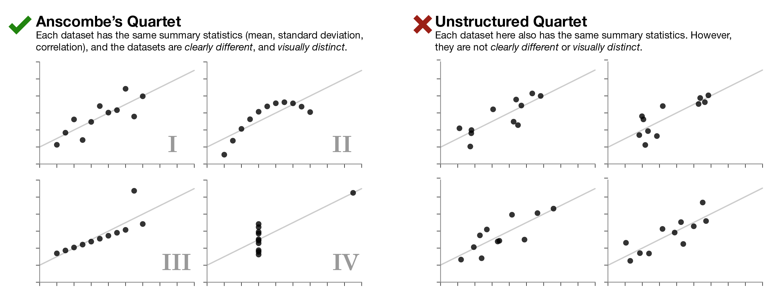
ABOVE: Fig. 1 Anscombe’s Quartet (left), and an “Unstructured Quartet” on the right, where the datasets have the same summary statistics as those in Anscombe’s Quartet, but lack underlying structure or visual distinction.
While very popular and effective for illustrating the importance of visualizing your data, they have been around for nearly 45 years, and it is not known how Anscombe came up with his datasets. So, we developed a technique to create these types of datasets—those which are identical over a range of statistical properties, yet produce dissimilar graphics.
Recently, Albert Cairo created the Datasaurus dataset which urges people to “never trust summary statistics alone; always visualize your data.” While the data exhibits normal-seeming statistics, plotting the data reveals a picture of a dinosaur. Inspired by Anscombe’s Quartet and Datasaurus, we present, The Datasaurus Dozon (download.csv).
ABOVE: Fig. 2. The Datasaurus Dozen. While different in appearance, each dataset has the same summary statistics (mean, standard deviation, and Pearson’s correlation) to two decimal places.
Method
The key insight behind our approach is that while it is relatively difficult to generate a dataset from scratch with particular statistical properties, it is relatively easy to take an existing dataset, modify it slightly, and maintain those statistical properties. We do this by choosing a point at random, moving it a little bit, then checking that the statistical properties of the set haven’t strayed outside the acceptable bounds. (In this particular case, we are ensuring that the means, standard deviations, and correlations remain the same to two decimal places.)
ABOVE: Fig 3. Making a number of small changes to a dataset on the left, while maintaining the same overall statistical properties (to two decimal places), shown on the right.
Repeating this subtle “perturbation” process enough times results in a completely different dataset. However, as mentioned above, in order for these datasets to be effective tools for underscoring the importance of visualizing your data, they need to be visually distinct and clearly different. We accomplish this by biasing the random point movements toward a particular shape. In the animation at right, we show the process of 200,000 iterations of perturbations toward a ‘circle’ shape.
ABOVE: Fig 4. Transforming a random cloud of points into a circle, while maintaining the same statistical properties.
To move the points toward a particular shape, we perform an additional check at each random perturbation. Besides checking the statistical properties are still valid, we also check to see if the point has moved closer to the target shape. If both of these conditions are met, we “accept” the new position, and move to the next iteration. To mitigate the possibility of getting stuck in a locally optimized solution, where other, more globally optimal solutions closer to the target shape are possible, we use a simulated annealing technique which begins by accepting some solutions where the point moves away from the target in the early iterations, and reduces the frequency of such acceptances over time.
To generate the Datasaurus Dozen, we created 12 shapes to direct the dots towards. Each of the resulting plots has the same summary statistics as the original Datasaurus, and in fact, all of the intermediate frames do as well. The process of converting the Datasaurus into each of these shapes can be seen below. Of course, the technique is not limited to these shapes, any collection of line segments could be used as a target.
ABOVE: Fig 5. Creating all of the datasets for the Dinosaurus Dozen. The inputs are the Datasaurus dataset on the left, and a set of target shapes in the middle. The iterations leading to the final datasets are shown on the right. All datasets, and all frames of the animations have the same summary statistics (x mean=54.26, y mean=47.83, x SD=16.76, y SD=26.93, Pearson’s R=0.06).
ABOVE: Iterating through the datasets sequentially, we can see how the data points morph from one shape to another, all the while maintaining the same summary statistical values to two decimal places throughout the entire process.
More Examples
Besides the Datasaurus Dozen, we have created several other example datasets using our technique. They are explained in more detail in the paper, and can be downloaded for your own visualizations.
One interesting property of our technique is that it can work for visualizations other than 2D scatter plots, and statistical properties beside the standard summary statistics. In the example below, each of the datasets start out as a normal distribution of points. The boxplot shown at the bottom is a standard “Tukey Boxplot,” which shows the 1st quartile, median, and 3rd quartile values on the “box,” and the “whiskers” showing the location of the furthest data points within the 1.5 interquartile ranges from the 1st and 3rd quartiles. Boxplots are commonly used to show the distribution of a dataset, and are better than simply showing the mean or median value. However, here we can see as the distribution of points changes, the box-plot remains the same.
ABOVE: Fig 7. Three varying 1D distributions of data, all with the same boxplot representation.
Another way to look at these 1D distributions is to consider a dataset with seven categories (Figure 8, below). The data in each category is shifting over time, as can clearly be seen in the “Raw” data view, yet the boxplots remain static. Violin plots are a good method for presenting the distribution of a dataset with more detail than is available with a traditional boxplot, it is important to make sure the underlying data is distributed in a way that important information is not hidden.
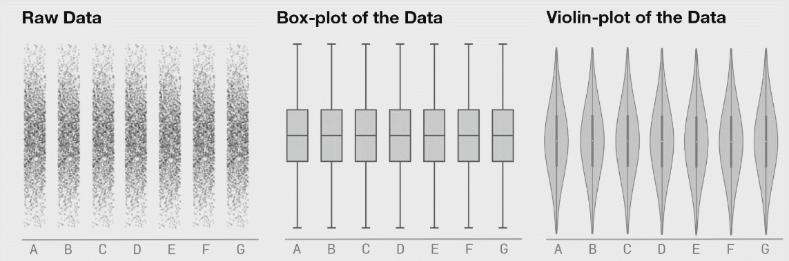
ABOVE: Fig 8. Seven distributions of data, shown as raw data points (of strip-plots), as box plots, and as violin plots.
Datasets and Code
The datasets presented on this page (and in the paper) are available for download. The Python source code is available for download here. We have tried to remove as many “extra” things from the code as possible to make it more readable, but it is still a bit rough. We would like to put it up on GitHub soon, and if there is enough interest, turn it into a real library. If you are a researcher and would like to see the original code (even though it might not run properly, and is quite “researchy”), please contact justin.matejka@autodesk.com.
Amazingly, and without any work on our part, these datasets have been turned into an R package (GitHub, cran package). This effort has been led by Stephanie Locke and Lucy McGowan. Thanks!
Acknowledgements
A special thanks to Alberto Cairo for creating the Datasaurus. When I asked if he had saved the datapoints from his original tweet, he hadn’t, but he very graciously (and quickly!) created a new (and even better) dinosaur drawing using the fantastic DrawMyData tool. Also thanks to Fraser Anderson for the idea to start with an existing dataset which has the desired statistical properties, rather than try to create one from scratch.
More Information
For more information, please see the research paper or watch the longer video embedded at the top of this page. For questions, please contact Justin Matejka through email (justin.matejka@autodesk.com) or on Twitter (@JustinMatejka).
Abstract
Datasets which are identical over a number of statistical properties, yet produce dissimilar graphs, are frequently used to illustrate the importance of graphical representations when exploring data. This paper presents a novel method for generating such datasets, along with several examples. Our technique varies from previous approaches in that new datasets are iteratively generated from a seed dataset through random perturbations of individual data points, and can be directed towards a desired outcome through a simulated annealing optimization strategy. Our method has the benefit of being agnostic to the particular statistical properties that are to remain constant between the datasets, and allows for control over the graphical appearance of resulting output.
Download publication
Get in touch
Something pique your interest? Get in touch if you’d like to learn more about Autodesk Research, our projects, people, and potential collaboration opportunities.
Contact us